Leicester, UK /
3:45 PM
Leicester, UK /
3:45 PM
5asec Mobile Application
Redefining Luxury Laundry through Systemic Mobile UX
Redefining Luxury Laundry through Systemic Mobile UX
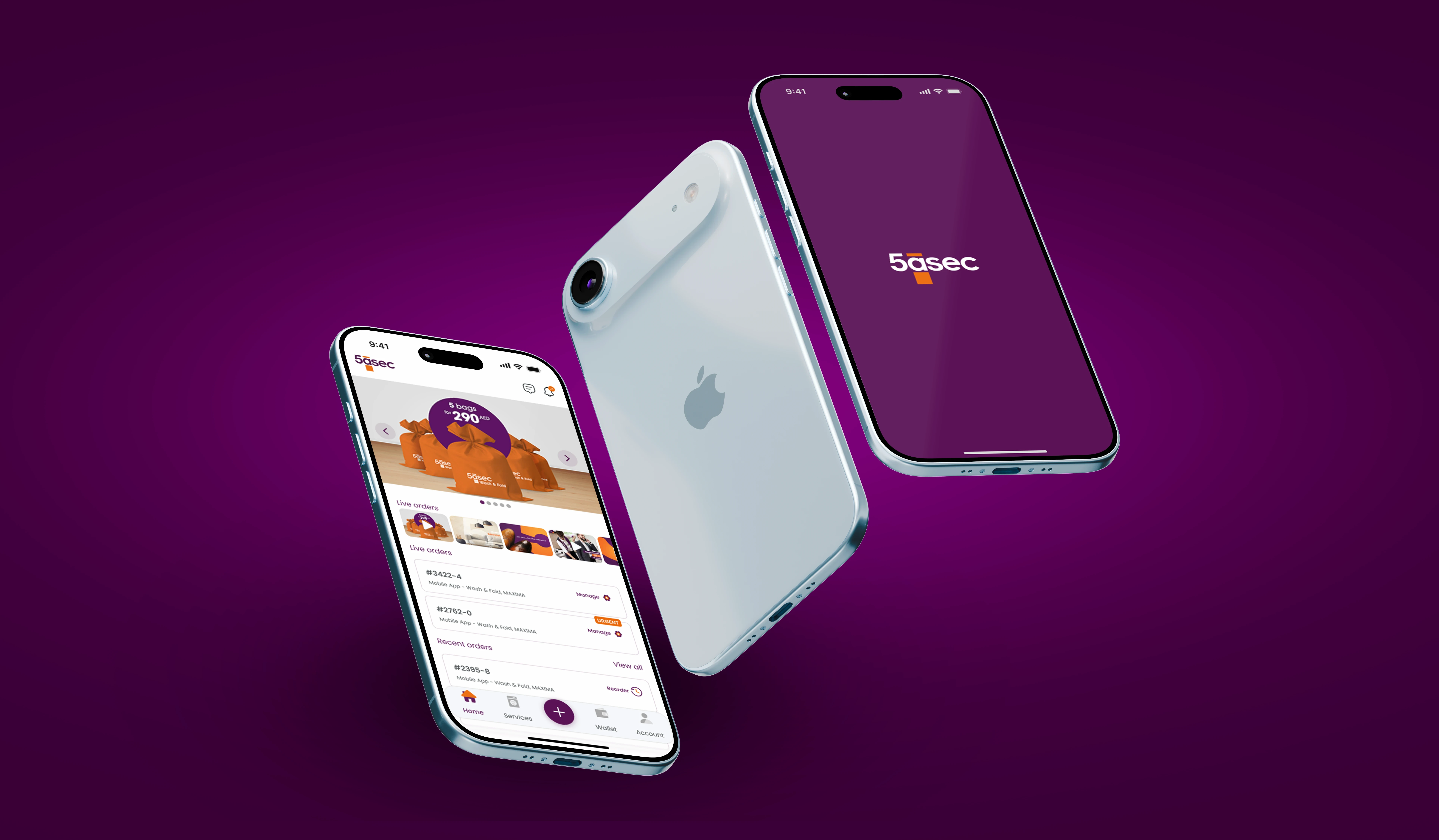
Screens
+
Order increase
+
%
date
Tools
Tools


Abstract
Goal: Redefine the mobile experience for the luxury 5àsec UAE service to align with the premium brand promise and overcome critical usability and operational friction.
The Paradox: The existing app was confusing and slow, driving customers away from the digital channel. The challenge was to convert a frustrating utility app into an efficient, trustworthy concierge service.
Impact: +31% Increase in Online Orders and +17% Increase in Saved Wallet Cards achieved within 80 days of launch, validating the strategic UX overhaul.
Goal: Redefine the mobile experience for the luxury 5àsec UAE service to align with the premium brand promise and overcome critical usability and operational friction.
The Paradox: The existing app was confusing and slow, driving customers away from the digital channel. The challenge was to convert a frustrating utility app into an efficient, trustworthy concierge service.
Impact: +31% Increase in Online Orders and +17% Increase in Saved Wallet Cards achieved within 80 days of launch, validating the strategic UX overhaul.
The Problem (The Core Conflict)

The initial research revealed a paradox: customers valued the high-quality service but rejected the confusing mobile experience. The app was failing its primary objective—to act as an efficient sales channel.
The initial research revealed a paradox: customers valued the high-quality service but rejected the confusing mobile experience. The app was failing its primary objective—to act as an efficient sales channel.
The insight that shaped the redesign: customers trusted the physical service but not the app. The trust built in-store wasn't carrying over into digital, this wasn't a features problem, it was a trust problem, and that reframed everything that followed.
The insight that shaped the redesign: customers trusted the physical service but not the app. The trust built in-store wasn't carrying over into digital, this wasn't a features problem, it was a trust problem, and that reframed everything that followed.
Design Process
I. Discovery & Synthesis
I ran surveys, interviews, and stakeholder workshops and found a paradox between luxury service and poor app usability. Defined 3 key personas.
+
0Participants
0User
Interviews0Usability
Tests0User
PersonaII. Simplified Order Flow (IA)
My first pass cut the flow to four steps - location, pickup/drop-off times, service selection, checkout. That was the leanest version I could design: fewest taps, fastest path to an order.
It didn't survive contact with operations. The team needed customer preferences and handling notes ( 'no starch,' 'delicate wash' ) to do the job correctly, and the four-step version had nowhere to capture that.
Making it a mandatory step would have undone the point of simplifying the flow in the first place, so I added it as an optional fifth step: one tap to skip for anyone who doesn't need it, there for anyone who does. The flow grew by one step, but stayed fast for the majority of orders.1. Select location

2. Select services
3. Pick up time
4. Drop off time
5. Preferences
III. Payment & Wallet Velocity
Redesigned the wallet from a list to a visual card carousel, making 'Add New Card' prominent and enabling One-Click Default setting.

Before

After
IV. Adaptability & Upselling
Integrated revenue streams (Urgent Service +50%) and built user trust (Contactless Toggle) using clear, contextual microcopy and mandatory confirmation switches.

V. Systemic Efficiency
Created a design system with accessible components to ensure consistency, improve brand alignment, and reduce the app size by 73% (480MB $\rightarrow$ 130MB).

I. Discovery & Synthesis
I ran surveys, interviews, and stakeholder workshops and found a paradox between luxury service and poor app usability. Defined 3 key personas.
+
0Participants
0User
Interviews0Usability
Tests0User
PersonaII. Simplified Order Flow (IA)
My first pass cut the flow to four steps - location, pickup/drop-off times, service selection, checkout. That was the leanest version I could design: fewest taps, fastest path to an order.
It didn't survive contact with operations. The team needed customer preferences and handling notes ( 'no starch,' 'delicate wash' ) to do the job correctly, and the four-step version had nowhere to capture that.
Making it a mandatory step would have undone the point of simplifying the flow in the first place, so I added it as an optional fifth step: one tap to skip for anyone who doesn't need it, there for anyone who does. The flow grew by one step, but stayed fast for the majority of orders.1. Select location
2. Select services
3. Pick up time
4. Drop off time
5. Preferences
III. Payment & Wallet Velocity
Redesigned the wallet from a list to a visual card carousel, making 'Add New Card' prominent and enabling One-Click Default setting.
Before
After
IV. Adaptability & Upselling
Integrated revenue streams (Urgent Service +50%) and built user trust (Contactless Toggle) using clear, contextual microcopy and mandatory confirmation switches.
V. Systemic Efficiency
Created a design system with accessible components to ensure consistency, improve brand alignment, and reduce the app size by 73% (480MB $\rightarrow$ 130MB).
I. Discovery & Synthesis
I ran surveys, interviews, and stakeholder workshops and found a paradox between luxury service and poor app usability. Defined 3 key personas.
+
0Participants
0User
Interviews0Usability
Tests0User
PersonaII. Simplified Order Flow (IA)
My first pass cut the flow to four steps - location, pickup/drop-off times, service selection, checkout. That was the leanest version I could design: fewest taps, fastest path to an order.
It didn't survive contact with operations. The team needed customer preferences and handling notes ( 'no starch,' 'delicate wash' ) to do the job correctly, and the four-step version had nowhere to capture that.
Making it a mandatory step would have undone the point of simplifying the flow in the first place, so I added it as an optional fifth step: one tap to skip for anyone who doesn't need it, there for anyone who does. The flow grew by one step, but stayed fast for the majority of orders.1. Select location
2. Select services
3. Pick up time
4. Drop off time
5. Preferences
III. Payment & Wallet Velocity
Redesigned the wallet from a list to a visual card carousel, making 'Add New Card' prominent and enabling One-Click Default setting.
Before
After
IV. Adaptability & Upselling
Integrated revenue streams (Urgent Service +50%) and built user trust (Contactless Toggle) using clear, contextual microcopy and mandatory confirmation switches.
V. Systemic Efficiency
Created a design system with accessible components to ensure consistency, improve brand alignment, and reduce the app size by 73% (480MB $\rightarrow$ 130MB).
I. Discovery & Synthesis
I ran surveys, interviews, and stakeholder workshops and found a paradox between luxury service and poor app usability. Defined 3 key personas.
+
0Participants
0User
Interviews0Usability
Tests0User
PersonaII. Simplified Order Flow (IA)
My first pass cut the flow to four steps - location, pickup/drop-off times, service selection, checkout. That was the leanest version I could design: fewest taps, fastest path to an order.
It didn't survive contact with operations. The team needed customer preferences and handling notes ( 'no starch,' 'delicate wash' ) to do the job correctly, and the four-step version had nowhere to capture that.
Making it a mandatory step would have undone the point of simplifying the flow in the first place, so I added it as an optional fifth step: one tap to skip for anyone who doesn't need it, there for anyone who does. The flow grew by one step, but stayed fast for the majority of orders.1. Select location
2. Select services
3. Pick up time
4. Drop off time
5. Preferences
III. Payment & Wallet Velocity
Redesigned the wallet from a list to a visual card carousel, making 'Add New Card' prominent and enabling One-Click Default setting.
Before
After
IV. Adaptability & Upselling
Integrated revenue streams (Urgent Service +50%) and built user trust (Contactless Toggle) using clear, contextual microcopy and mandatory confirmation switches.
V. Systemic Efficiency
Created a design system with accessible components to ensure consistency, improve brand alignment, and reduce the app size by 73% (480MB $\rightarrow$ 130MB).
I. Discovery & Synthesis
I ran surveys, interviews, and stakeholder workshops and found a paradox between luxury service and poor app usability. Defined 3 key personas.
+
0Participants
0User
Interviews0Usability
Tests0User
PersonaII. Simplified Order Flow (IA)
My first pass cut the flow to four steps - location, pickup/drop-off times, service selection, checkout. That was the leanest version I could design: fewest taps, fastest path to an order.
It didn't survive contact with operations. The team needed customer preferences and handling notes ( 'no starch,' 'delicate wash' ) to do the job correctly, and the four-step version had nowhere to capture that.
Making it a mandatory step would have undone the point of simplifying the flow in the first place, so I added it as an optional fifth step: one tap to skip for anyone who doesn't need it, there for anyone who does. The flow grew by one step, but stayed fast for the majority of orders.1. Select location
2. Select services
3. Pick up time
4. Drop off time
5. Preferences
III. Payment & Wallet Velocity
Redesigned the wallet from a list to a visual card carousel, making 'Add New Card' prominent and enabling One-Click Default setting.
Before
After
IV. Adaptability & Upselling
Integrated revenue streams (Urgent Service +50%) and built user trust (Contactless Toggle) using clear, contextual microcopy and mandatory confirmation switches.
V. Systemic Efficiency
Created a design system with accessible components to ensure consistency, improve brand alignment, and reduce the app size by 73% (480MB $\rightarrow$ 130MB).
I. Discovery & Synthesis
I ran surveys, interviews, and stakeholder workshops and found a paradox between luxury service and poor app usability. Defined 3 key personas.
+
0Participants
0User
Interviews0Usability
Tests0User
PersonaII. Simplified Order Flow (IA)
My first pass cut the flow to four steps - location, pickup/drop-off times, service selection, checkout. That was the leanest version I could design: fewest taps, fastest path to an order.
It didn't survive contact with operations. The team needed customer preferences and handling notes ( 'no starch,' 'delicate wash' ) to do the job correctly, and the four-step version had nowhere to capture that.
Making it a mandatory step would have undone the point of simplifying the flow in the first place, so I added it as an optional fifth step: one tap to skip for anyone who doesn't need it, there for anyone who does. The flow grew by one step, but stayed fast for the majority of orders.1. Select location
2. Select services
3. Pick up time
4. Drop off time
5. Preferences
III. Payment & Wallet Velocity
Redesigned the wallet from a list to a visual card carousel, making 'Add New Card' prominent and enabling One-Click Default setting.
Before
After
IV. Adaptability & Upselling
Integrated revenue streams (Urgent Service +50%) and built user trust (Contactless Toggle) using clear, contextual microcopy and mandatory confirmation switches.
V. Systemic Efficiency
Created a design system with accessible components to ensure consistency, improve brand alignment, and reduce the app size by 73% (480MB $\rightarrow$ 130MB).
I. Discovery & Synthesis
I ran surveys, interviews, and stakeholder workshops and found a paradox between luxury service and poor app usability. Defined 3 key personas.
+
0Participants
0User
Interviews0Usability
Tests0User
PersonaII. Simplified Order Flow (IA)
My first pass cut the flow to four steps - location, pickup/drop-off times, service selection, checkout. That was the leanest version I could design: fewest taps, fastest path to an order.
It didn't survive contact with operations. The team needed customer preferences and handling notes ( 'no starch,' 'delicate wash' ) to do the job correctly, and the four-step version had nowhere to capture that.
Making it a mandatory step would have undone the point of simplifying the flow in the first place, so I added it as an optional fifth step: one tap to skip for anyone who doesn't need it, there for anyone who does. The flow grew by one step, but stayed fast for the majority of orders.1. Select location
2. Select services
3. Pick up time
4. Drop off time
5. Preferences
III. Payment & Wallet Velocity
Redesigned the wallet from a list to a visual card carousel, making 'Add New Card' prominent and enabling One-Click Default setting.
Before
After
IV. Adaptability & Upselling
Integrated revenue streams (Urgent Service +50%) and built user trust (Contactless Toggle) using clear, contextual microcopy and mandatory confirmation switches.
V. Systemic Efficiency
Created a design system with accessible components to ensure consistency, improve brand alignment, and reduce the app size by 73% (480MB $\rightarrow$ 130MB).
I. Discovery & Synthesis
I ran surveys, interviews, and stakeholder workshops and found a paradox between luxury service and poor app usability. Defined 3 key personas.
+
0Participants
0User
Interviews0Usability
Tests0User
PersonaII. Simplified Order Flow (IA)
My first pass cut the flow to four steps - location, pickup/drop-off times, service selection, checkout. That was the leanest version I could design: fewest taps, fastest path to an order.
It didn't survive contact with operations. The team needed customer preferences and handling notes ( 'no starch,' 'delicate wash' ) to do the job correctly, and the four-step version had nowhere to capture that.
Making it a mandatory step would have undone the point of simplifying the flow in the first place, so I added it as an optional fifth step: one tap to skip for anyone who doesn't need it, there for anyone who does. The flow grew by one step, but stayed fast for the majority of orders.1. Select location
2. Select services
3. Pick up time
4. Drop off time
5. Preferences
III. Payment & Wallet Velocity
Redesigned the wallet from a list to a visual card carousel, making 'Add New Card' prominent and enabling One-Click Default setting.
Before
After
IV. Adaptability & Upselling
Integrated revenue streams (Urgent Service +50%) and built user trust (Contactless Toggle) using clear, contextual microcopy and mandatory confirmation switches.
V. Systemic Efficiency
Created a design system with accessible components to ensure consistency, improve brand alignment, and reduce the app size by 73% (480MB $\rightarrow$ 130MB).
IV. Impact & Future Vision
The systemic solutions delivered a rapid, quantifiable return on investment: +31% growth in online orders and +17% in saved payment methods within 80 days of launch. The redesign successfully delivered on the promise of a convenient, premium service.
The systemic solutions delivered a rapid, quantifiable return on investment: +31% growth in online orders and +17% in saved payment methods within 80 days of launch. The redesign successfully delivered on the promise of a convenient, premium service.
Interactive prototype
Interactive prototype
Place order
Home page
The Wallet
Future Vision: Garment Care Profile
The strategic recommendation for the next phase was to deepen the luxury positioning by focusing on Customer Lifetime Value (CLV):
Objective: Elevate the service from utility to a personalized premium offering.
Feature: Introduce a 'Garment Care Profile' feature.
Function: Allow high-value users to set specific, saved preferences for individual item categories (e.g., 'always use light starch on trousers'). This leverages the existing re-order efficiency and transforms the app into a personalized, high-touch concierge service.
Future Vision: Garment Care Profile
The strategic recommendation for the next phase was to deepen the luxury positioning by focusing on Customer Lifetime Value (CLV):
Objective: Elevate the service from utility to a personalized premium offering.
Feature: Introduce a 'Garment Care Profile' feature.
Function: Allow high-value users to set specific, saved preferences for individual item categories (e.g., 'always use light starch on trousers'). This leverages the existing re-order efficiency and transforms the app into a personalized, high-touch concierge service.